


Finally, A Real Map

Finally, A Real Map
Finally, A Real Map
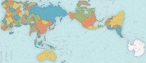
Japan’s 2016 Good Design Award results were announced recently, including the Grand Award. Last year’s winner was a personal mobility chair; in 2014 it was a robotic arm. This year, the grand prize went to a world map.
Astonishingly, the most widely used image we have of this planet is the Mercator map, done by geographer Gerardus Mercator in 1569. Not astonishingly, it has some major flaws, starting with dramatic distortions in the size of Antarctica and Greenland. But apparently everybody figured it was close enough and just kept using it for the last 450 years. Everybody except Tokyo-based architect and artist Hajime Narukawa who had a major issue with our current map and has been working for years to fix it.
According to the website, Spoon & Tamago, “Narukawa developed a map projection method called AuthaGraph (and founded a company of the same name in 2009) which aims to create maps that represent all land masses and seas as accurately as possible. Narukawa points out that in the past, his map probably wasn’t as relevant. A large bulk of the 20th century was dominated by an emphasis on East and West relations. But with issues like climate change, melting glaciers in Greenland and territorial sea claims, he decided it’s time we establish a new view of the world: one that equally perceives all interests of our planet.
“AuthaGraph not only faithfully represents all oceans and continents, but the map can be tessellated just like an MC Escher painting. Much in the same way that we can traverse the planet without ever coming to an end, “the AuthaGraphic world map provides an advanced precise perspective of our planet.””
